NovaLoca’s Updated Website Design!
You may have noticed that we have updated the design of our website. Not only does our new site look more clean and up-to-date, users can now see more of a property on a results page, making it easier to browse for properties.
Continuous Investment
Technology doesn’t stand still and nor does NovaLoca. We are keen to continually invest in NovaLoca to ensure that our site users get the best experience possible and to reassure our clients that their money is going to good use to continuously improve the service they receive.
We’ve compared our site traffic for the last 2 weeks to the 2 weeks prior to our site release and users, new users, sessions and average session durations have all increased by around 20% since our updated site release.
Improving mobile experience
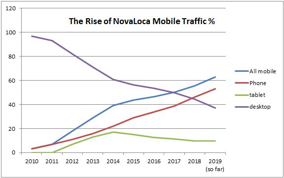
While we already had a mobile version of our site, not all features we had on our desktop site were on the mobile version. It is important to us to ensure that mobile users are getting the same experience as desktop users, particularly as the amount of people using our site on mobile is rapidly increasing each year.

As you can see in the graph above, the amount of people viewing NovaLoca on mobile has increased rapidly since 2010 and phone users alone overtook desktop users last year, while all mobile users (phone and tablet) overtook desktop in 2017. While this may not be surprising for some industries, since NovaLoca targets businesses, we often expect more desktop users, but the graph shows that more and more people are using mobiles to browse for commercial property.
