Four Graphic Design Trends for Commercial Property Professionals

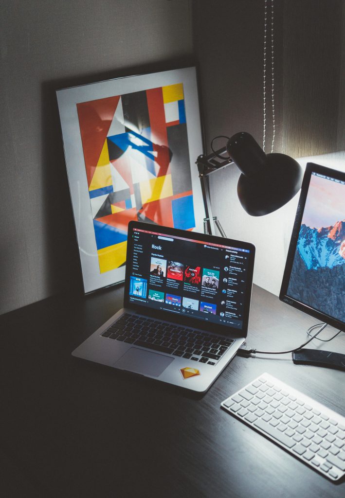
Photo by Nikita Kachanovsky on Unsplash
I like to take some time at the start of the year to find what experts’ are predicting will be hot in the world of property, marketing and design.
I’m starting with graphic design. Graphic design plays a major role in the commercial property sector as it serves as a powerful tool to communicate and market properties to potential clients. A well-designed logo, website, brochures, signage, and other marketing materials can convey professionalism, credibility, and quality, influencing the perception of the properties and the company itself.
So let’s have a look at 4 graphic design trends for 2024 and how these can be used for a commercial property website or social media channel.
Surrealism
The rise of AI technology and tools appears to be inspiring a surrealistic graphic design trend. Surrealism is the combination of uncanny (often dreamlike) and unexpected imagery. Its aim is to provoke intellectual and emotional responses and offer fresh perspectives. It is going to appeal to a digital savvy audience. It often uses vibrant and bold colours in unexpected combinations which could create depth and visual interest. How about encouraging user engagement through gamification or interactive elements that challenge perceptions or invite users to explore hidden features within a website?
Nostalgia
Many design professionals are predicting that nostalgia will be popular in 2024 but they don’t seem to agree on which particular time period will be trending. Some were expecting a look back to the 60’s and 70’s others were going further back to an Art Nouveau aesthetic.
The one thing that can be agreed is that nostalgia holds timeless allure. It can be a powerful tool in the commercial property sector as it taps into people’s emotions and creates a sense of familiarity and comfort. This could involve using retro fonts, vintage colours, or iconic imagery from the past.
Quiet luxury
This is a trend that is believed to have been influenced by the many “aspirational aesthetic” posts on social media. It calls for minimal, elegant designs and often uses a neutral colour palette.
By integrating the concept of quiet luxury into the graphic design of a commercial property website you can evoke a sense of sophistication, elegance, and exclusivity. Use plenty of white space, simple navigation, and elegant typography to create a sense of calmness and refinement.
Showcase high-resolution, professional photographs that highlight the luxurious aspects of properties. Use images that focus on intricate details, exquisite architecture, and upscale amenities to convey a sense of opulence.
Ensure consistency in design elements across various devices and platforms to maintain a seamless and luxurious browsing experience for users.
Eco concerns
Eco concerns continue to be a focus in all areas of modern life and environmentally focused designs are a trend that is growing as more companies look to communicate their dedication to eco-concerns and sustainability.
You could use nature-inspired imagery, such as landscapes, greenery, or eco-friendly architecture. Include earthy tones like greens, browns, blues, and soft neutrals. These colours can evoke a sense of environmental responsibility and harmony with nature.
Incorporate visuals that showcase sustainability, such as solar panels, green roofs, or eco-friendly building materials. Highlight environmentally friendly amenities within properties, such as community gardens, bike storage, EV charging stations, or energy-efficient appliances. Use visuals or dedicated sections to showcase these features.
Ensure the website itself aligns with eco-concerns by optimising for energy efficiency. Implement responsive design, optimise images for faster loading times, and use clean code to reduce server strain and energy consumption.
If you are a commercial property professional looking for a stress free web solution head over to the Zipbox website to discover how we can help you get set up quickly at a cost effective price.
